Increase user engagement popups are a useful tool for websites looking to keep visitors on their site for longer periods of time. The popups may include interactive elements, such as games, polls, or quizzes, to engage visitors and keep them on the site.
User engagement increasing popups can effectively improve retention and reduce bounce rates for websites. They can also be used to collect valuable data and insights from visitors or to promote special offers or discounts.
User Engagement Boosting Popups by Popupsmart
Engaging users is your first step in the conversion process.
Promote your related content, product, or campaign to boost user engagement and keep them on your site longer.
Choose your popup and customize your messages in 5 minutes to engage your audience with Popupsmart.

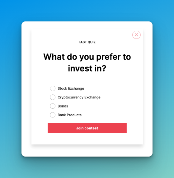
Run a Contest: Host a contest to engage customers on your site. Convert indecisive visitors into customers and use an exit popup to keep them from abandoning too quickly. Don't forget to collect emails and grow your list at the same time. Pro Tip: Integrate with an email marketing service and add a countdown timer to boost your campaign.
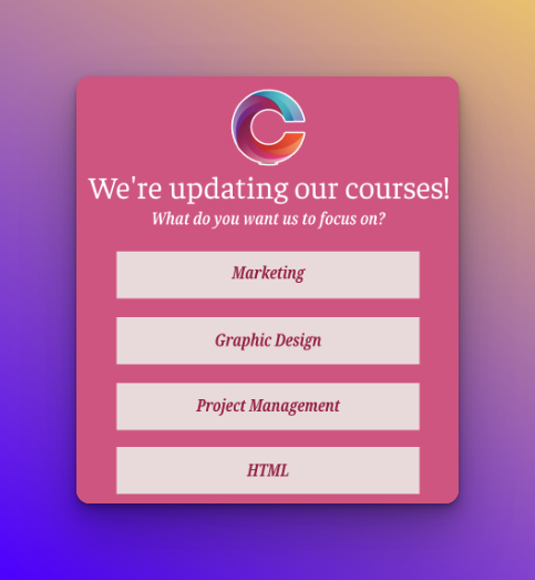
Create a Fun Quiz: Build a quiz popup to engage visitors. Use dropdown, checkbox, or radio inputs to create a user-friendly one. You can benefit from the collected data in your future marketing efforts and ad campaigns.
Display Videos: Increase both your YouTube views and website engagement rates by displaying a popup video on your site. Choose to autoplay to catch the visitors.
Promote Blog Posts: Get more engagement on your recent blog posts by promoting them with popups. Use scroll-based targeting to suggest a related article.
Collect Social Media Followers: Gain new social media followers from your site by adding a redirect URL to your popup button. Whether your website visitors are customers or not yet.
Whether it's through hosting contests, creating fun quizzes, displaying videos, promoting blog posts, or collecting social media followers, popups provide an effective and efficient way to engage your audience and achieve your marketing goals.
Visitor Engagement Increasing Popups by Poptin
Engaging website visitors is essential to increasing conversions and generating leads. One way to do this is by using Poptin to conduct surveys, get feedback, and offer visitors additional content that they may be interested in.
Using Poptins to conduct surveys can provide valuable insights into visitors' needs, wants, and preferences. This can help you to tailor your website's content and offerings to meet those needs better and increase engagement. Surveys can also help you to identify areas where your website needs improvement, so you can make changes to boost engagement and conversions.

Getting feedback from visitors can also be a great way to improve engagement. By making it easy for visitors to leave comments or testimonials, you can get a sense of what they like and dislike about your website and make changes accordingly. Feedback can also help you to identify issues that are causing visitors to leave your website without converting.
Another way to increase engagement is by offering visitors additional content that they may be interested in. This might include blog posts, videos, infographics, or other types of content that are related to the topic of the Poptin or website. By providing visitors with additional content, you can increase the amount of time they spend on your website, which can ultimately lead to increased engagement and conversions.
It's important to have a clear call to action and make sure that the Poptin is timed correctly so that it appears when the visitor is most engaged on the website; having relevant and interesting content and surveys that are easy to complete can greatly increase engagement and conversion rate.
Overall, by using Poptin to conduct surveys, get feedback, and offer visitors additional content, you can increase engagement and improve the performance of your website. This can ultimately lead to more leads, sales, and conversions for your business.
User Engagement Increasing Popups by Privy
Utilize high-converting displays like customizable popups, flyouts, and more to transform casual browsers into loyal subscribers with Privy.
Attract new customers with welcome incentives

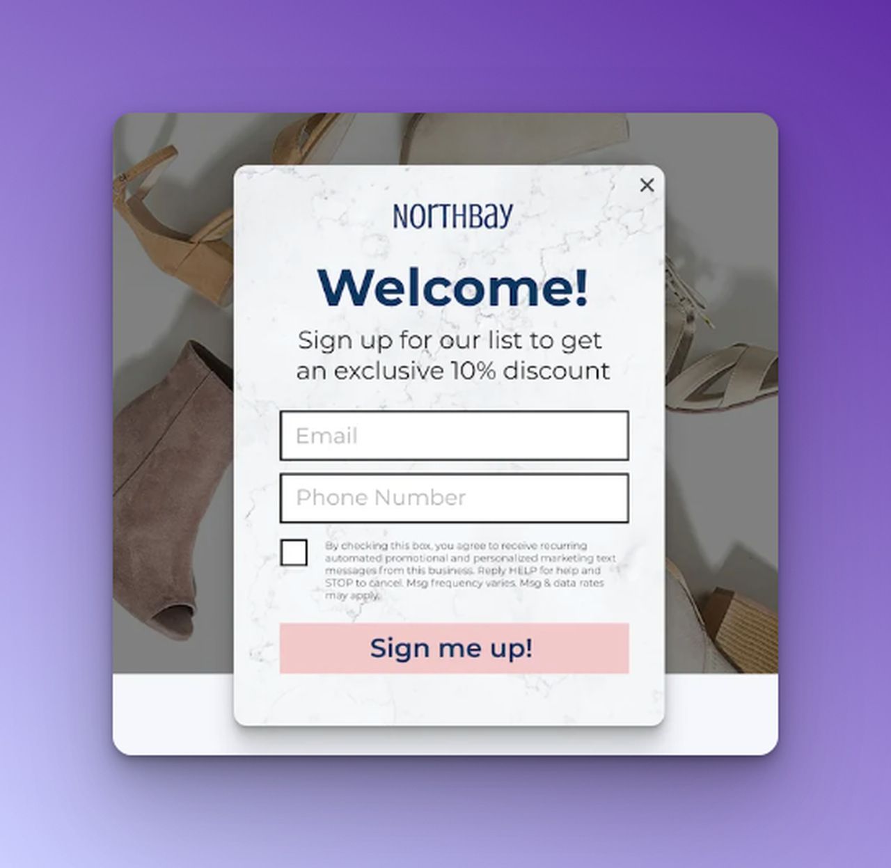
Encourage new visitors to purchase from your Shopify store by offering a first-time discount in exchange for an email or phone number.
Increase subscriber engagement with interactive spin-to-wins
Make signing up for your email or SMS list an enjoyable experience by adding an interactive spin-to-win wheel and customizing the prizes to your liking.
Ensure a seamless shopping experience with mobile-optimized popups
Regardless of whether a customer is shopping on their desktop, smartphone, or tablet, their experience will not be disrupted by Privy popups.
User Engagement Increasing Popups by Sumo
Adding a call to action (CTA) on a website is an essential element of website design and user experience. A CTA is a button or link that prompts the user to perform a specific action, such as making a purchase or signing up for a newsletter. To create an effective CTA with Sumo, it is essential to consider the following factors:
Prominence:
The CTA should be prominently displayed on the webpage, so it is easy for users to find and click on. This can be achieved by using contrasting colors, bold text, and proper placement on the page. The CTA should be placed in a location that is easily visible and accessible to the user, such as above the fold or in a prominent sidebar.

Clarity:
The CTA should be clear and concise, giving the user a clear understanding of what they will get after clicking on it. Use action-oriented phrases such as "Sign Up Now," "Get Your Discount," or "Learn More" to attract the user's attention.
Conversion-oriented:
The CTA should be designed with the goal of converting visitors into customers or subscribers. This can be achieved by making the CTA stand out visually and by providing a clear and compelling value proposition.
A/B Testing:
To increase conversion rates, A/B testing can be used to find the best design and placement of your CTA. A/B testing compares two versions of a webpage or CTA to determine which one performs better.
This can be done by creating two versions of the CTA and showing them to different groups of visitors. By analyzing the results of the test, you can determine which version of the CTA performs better and make adjustments accordingly.


